
How Color Psychology Influences Interior Design Choices
Color plays a powerful role in shaping how a home feels. Beyond aesthetics, colors influence mood, energy levels, focus, comfort, and even social interaction inside living spaces. Thoughtful color selection helps homeowners create interiors that support both emotional well-being and functional living.
Understanding color psychology allows you to design spaces that feel balanced, welcoming, and aligned with everyday activities.
Why Color Psychology Matters in Interior Design
Every color communicates a subtle emotional message. Designers use this principle intentionally to shape how rooms are experienced.
Color influences:
- Perception of room size
- Emotional comfort levels
- Energy and productivity
- Relaxation quality
- Social interaction patterns
Choosing colors strategically helps ensure that each space supports its intended purpose.
Warm Colors Create Energy and Social Connection
Warm tones naturally stimulate activity and conversation, making them ideal for shared living areas.
Common warm tones include:
- Soft reds
- Terracotta shades
- Warm oranges
- Golden yellows
These colors work well in:
- Living rooms
- Dining spaces
- Entryways
- Social gathering areas
Used carefully, warm tones make interiors feel lively and welcoming without becoming overwhelming.
Cool Colors Support Calm and Relaxation
Cool tones are associated with peace, clarity, and mental rest. They are especially effective in private areas of the home.
Popular calming shades include:
- Soft blues
- Muted greens
- Gentle lavender tones
- Cool greys
These colors are ideal for:
- Bedrooms
- Reading corners
- Bathrooms
- Study areas
Cool palettes help create environments that encourage rest and concentration.
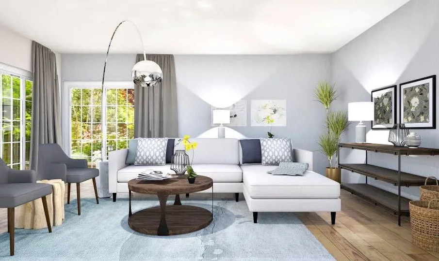
Neutral Colors Provide Flexibility and Balance
Neutral colors act as the foundation of many modern interiors because they support layering and adaptability.
Common neutral options include:
- White
- Beige
- Cream
- Light grey
- Taupe
Benefits of neutral interiors include:
- Increased visual space perception
- Easy coordination with furniture
- Long-term style flexibility
- Improved natural light reflection
Neutral palettes create calm backgrounds that allow accent elements to stand out.
Blue Enhances Focus and Mental Clarity
Blue is widely recognized as one of the most effective colors for improving concentration and reducing stress.
Designers often use blue in:
- Home offices
- Study areas
- Bedrooms
- Meditation corners
Lighter shades promote calmness, while deeper blues add sophistication and depth.
Green Promotes Balance and Natural Comfort
Green connects interiors with nature and supports emotional stability. It is one of the most versatile colors in residential design.
Green works well in:
- Living rooms
- Kitchens
- Bedrooms
- Indoor plant styling areas
Its association with natural environments makes it especially comforting for everyday living.
Yellow Encourages Optimism and Brightness
Yellow reflects warmth, sunlight, and positivity. When used carefully, it can make interiors feel cheerful and inviting.
Effective applications include:
- Kitchens
- Breakfast areas
- Hallways
- Workspaces needing energy
Soft yellow tones work better than strong shades for maintaining comfort without visual fatigue.
Red Adds Warmth but Requires Careful Use
Red is one of the most stimulating interior colors. It increases energy levels and can influence appetite and conversation.
Best uses include:
- Accent walls
- Dining areas
- Decorative accessories
- Statement furniture pieces
Because of its intensity, red works best when balanced with neutral surroundings.
White Creates Openness and Visual Simplicity
White remains one of the most widely used interior colors because it improves brightness and spatial perception.
Advantages of white interiors include:
- Enhanced natural light reflection
- Clean visual appearance
- Compatibility with all décor styles
- Increased sense of spaciousness
Layering textures alongside white prevents spaces from feeling too minimal.
Dark Shades Add Depth and Sophistication
Deep tones are increasingly used in modern homes to create contrast and visual richness.
Popular darker choices include:
- Charcoal grey
- Navy blue
- Forest green
- Deep brown accents
These shades work best in:
- Feature walls
- Bedrooms
- Reading spaces
- Accent furniture
When balanced with lighter elements, darker tones create elegant interiors.
Choosing the Right Color for Each Room’s Purpose
Color selection becomes more effective when matched with how each space is used.
Helpful room-based color strategies include:
- Energizing tones for kitchens
- Calm shades for bedrooms
- Balanced neutrals for living rooms
- Focus-supporting colors for workspaces
- Welcoming tones for entry areas
Purpose-driven color planning improves both functionality and comfort.
FAQ: How Color Psychology Influences Interior Design Choices
1. Can color choices affect how large or small a room appears?
Yes. Light colors reflect more light and make rooms feel larger, while darker shades create a more intimate atmosphere.
2. Is it better to paint an entire room one color or combine multiple shades?
Combining complementary shades often creates depth and prevents interiors from feeling flat or overly uniform.
3. Do cultural preferences influence color psychology in home design?
Yes. Cultural background can affect how certain colors are interpreted and preferred within living environments.
4. How important is natural lighting when selecting interior colors?
Natural light changes how colors appear throughout the day, so testing shades in different lighting conditions is essential.
5. Can ceiling color influence how a room feels?
Yes. Lighter ceilings make rooms feel taller, while darker ceilings create a cozier and more enclosed atmosphere.
6. Should flooring color match wall color exactly?
Matching is not necessary. Complementary contrast between walls and floors usually creates better visual balance.
7. How often should interior colors be updated in a home?
Many homeowners refresh color palettes every few years, especially when updating furniture or changing décor styles.


